I’ve decided to dedicate my first year post-graduation to figuring out all the important life skills and strategies that you don’t learn in school. Recently I have been fixating on budgets, which lead me to consider convenience costs. Most people are probably familiar with the idea of convenience cost – things are more expensive when they are prepared for you, delivered to you, etc. It’s important because it’s how the businesses that provide the convenience are able to make a profit. However, at some point you have to determine when the added convenience isn’t worth the cost. In digging deeper, I found convenience costs to be a case of diminishing returns.
As any economist would be happy to explain, diminishing returns is a phrase used to describe a phenomenon when, for every additional input (time, money), the additional value added decreases. This arises in a lot of, or even most, personal purchases. The difference between a $100 meal and a $120 meal is likely much less than the difference between a $5 meal and a $25 meal, even though the difference in price is the same between both pairs.
A wise teacher I had once told the class that graphs are a great way to make a point except when you’re trying to settle an argument with your significant other. Luckily, that is not the case here, so I will use a graph to show how convenience costs display diminishing returns. This one got complicated enough that I had to upgrade from my usual MS Paint diagrams to Excel. My item of choice will be the universal favorite, pizza, since you can get it in a large number of ways, with varying convenience.
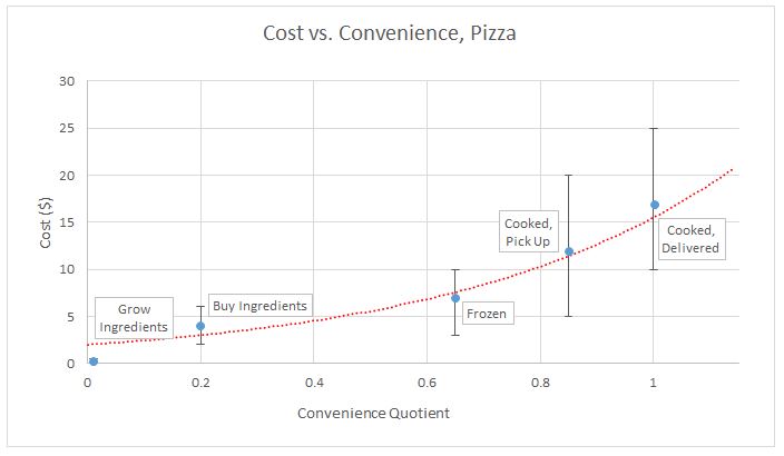
As you can see, the graph displays the cost on the y-axis and my made up “convenience quotient” on the x-axis. The convenience quotient ranges from 0, for completely inconvenient, to 1, for most convenient. The five blue points are different methods of getting pizza, all labelled. The vertical lines attached to them show the typical range of prices, with the blue point being roughly the average. The red line is a curve fit to the data, ignoring the “Grow Ingredients” point, which is pretty impractical for most people, so it’s not worth considering too heavily.
The curve bending upwards as it moves right is the defining characteristic of diminishing returns. Once you’re far enough along the convenience axis that you don’t even need an oven to enjoy your pizza, the cost of the additional convenience (not needing to leave your house) is about $5. This $5 by itself could get you from no pizza at all to a pizza that you make, or even one you just have to heat up, if it’s on the cheaper side. I think that’s much more of a jump than walking/driving vs. not walking/driving. If you aren’t convinced that’s the case, then think about this: if you already wanted pizza, and there was a place in your town giving it away for free, you just had to pick it up, would you do it? If you answered “yes,” then you do indeed think the pizza is more valuable than not having to move.
So, what’s the point of all of this? Well, other than this investigation conveniently requiring me to eat more pizza to “gather data”, it also gave some useful personal finance information. Almost no one has an effectively infinite amount of money, so I think most would agree that it’s a good idea to try to get the best bang for your buck, so to speak. To do that in this case, we want to choose the point with the highest convenience-to-price (CTP) ratio.
To find CTP, you find the slope of a line going from the origin of the above graph to the point you want the CTP of, and divide 1 by that slope (or take the reciprocal, for those of you who remember their math vocab. Even better, take the multiplicative inverse, if you remember your middle school math vocab), as the slope is price-to-convenience ratio. This means that the maximum CTP will be the point with the shallowest slope to the origin:
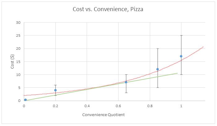
The frozen pizza has the highest CTP, because you can see that you’d have to make that green line steeper to make it intersect any of the other points, thus making the slope greater and CTP less. However, there’s one point that has been ignored to this point: frozen pizza is generally lower quality. So, if that data point is ignored due to lacking quality, we get the true champion of CTP:
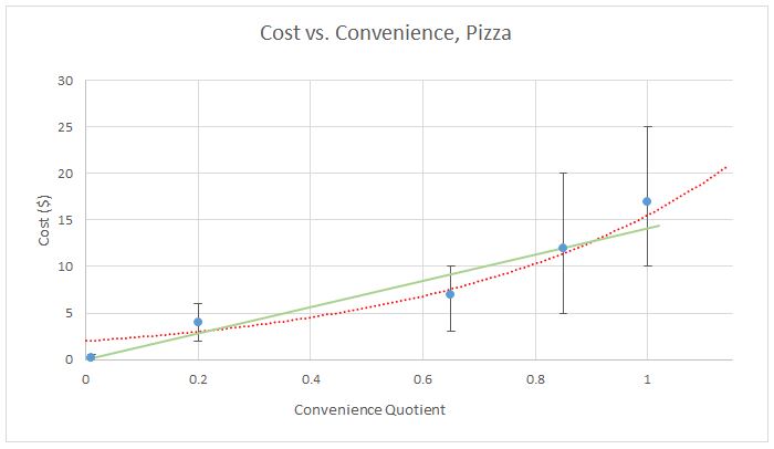
There it is – qualitative proof that ordering a pizza that you pick up yourself is the best value out there when it comes to quality pizza. Of course this is a simplification – there are price ranges, so the true data isn’t so clean, plus the convenience quotient can vary by person and even by variables like the weather or whether you feel sick.
While the bulk of this post was about pizza, the real premise of it was the idea of maximizing value per dollar in cases of diminishing returns. To show that this concept reaches much more than just cases of convenience costs, I have another short example, sans arbitrary graph: A standard well-running car will get you from point A to point B effectively with little else; meanwhile a luxury car worth twice as much might get you from A to B but also be more comfortable and fun to drive. However, for twice the price you really aren’t getting twice the value, because the ability to get places easily is way more of a step up than having a fun-to-drive car. Meanwhile, a supercar worth twice the price of the luxury car will be even more fun, but is it really twice as valuable to you? Most likely not, as, once again, the ability to get from A to B is still by far the biggest advantage, and that doesn’t improve at all with more expensive cars. In conclusion, unless you have excessive amounts of disposable income, you might want to think about cases where you see diminishing returns, and optimize the value you get..
Bonus thought of the day: It's interesting that the number of spacial dimensions our universe has limits the way we can organize data in a table (We can only show a 2D table on a screen, but in a 4D universe, you would be able to show a 3D table and have an extra variable displayed).
Write a comment